Brand Guidelines
Get Reconnected Overview
Logo

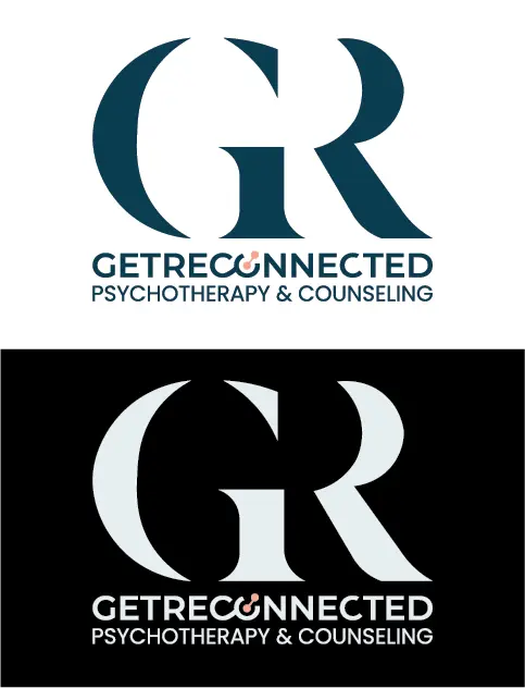
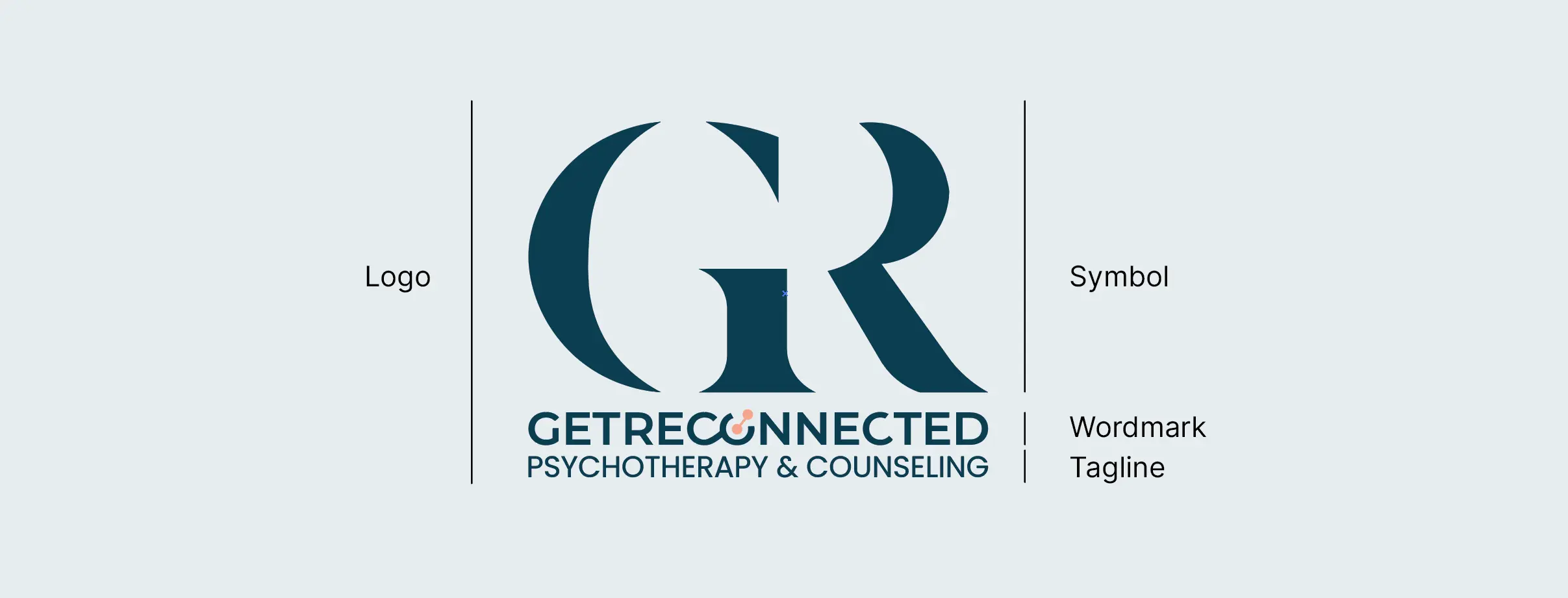
Logo Anatomy
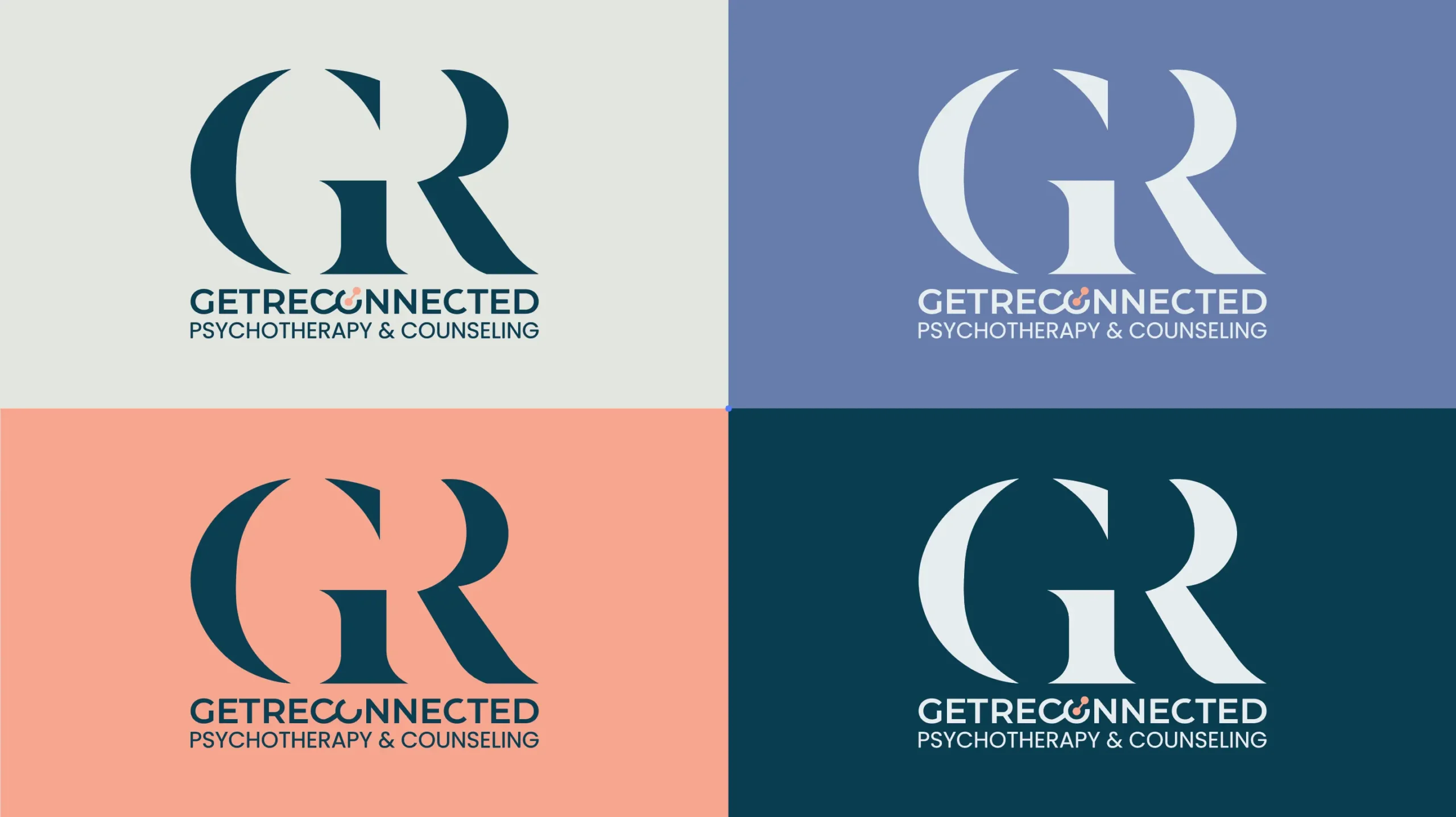
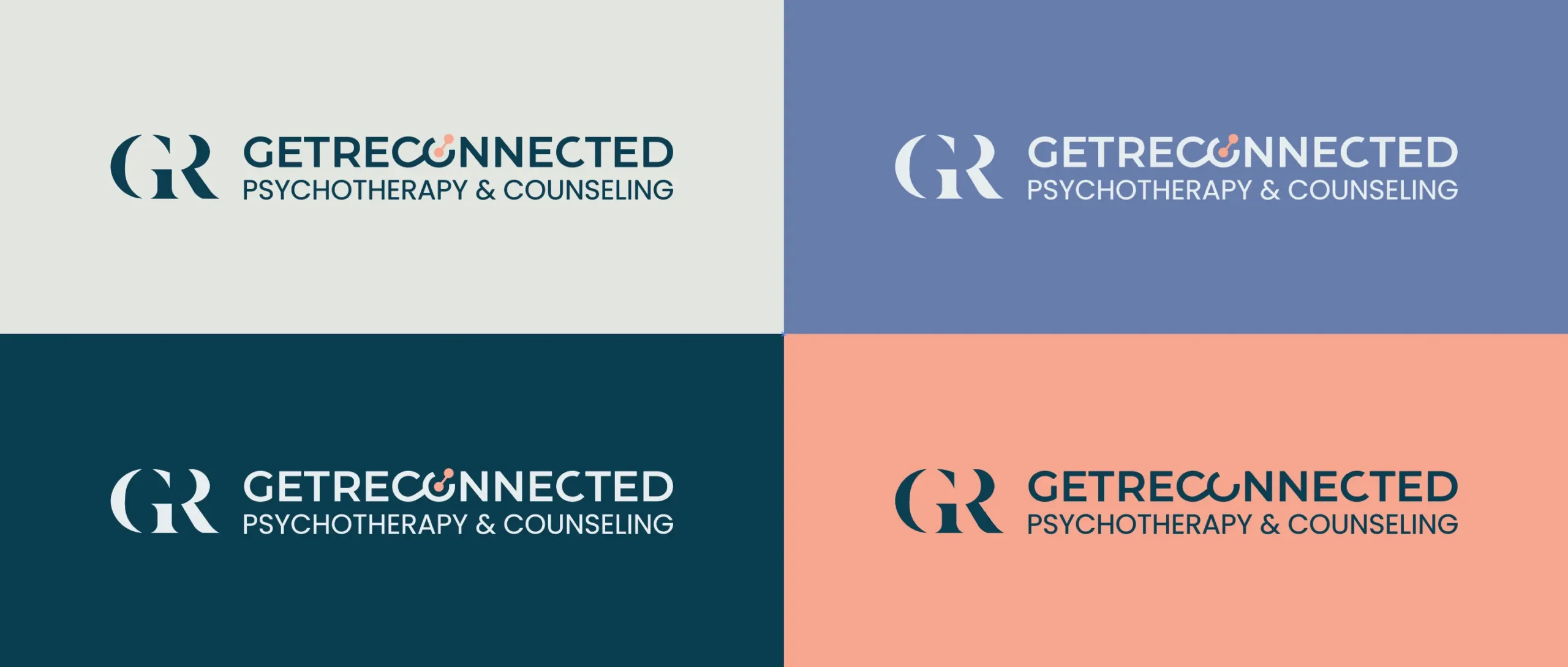
Primary Logo Color Variants
Primary Logo (horizontal) Color Variants
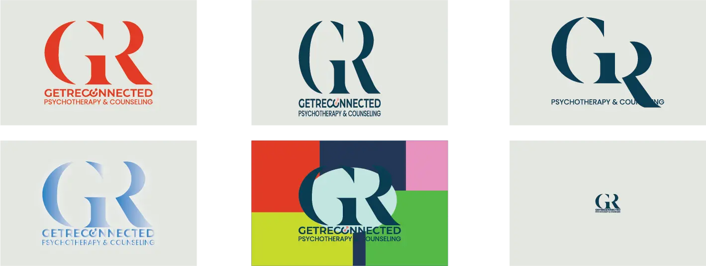
DONT’S IN LOGO USAGE
Strictly avoid these while using GET RECONNECTED logo.
– Do not combine the logo with other logos or graphic elements without proper authorization.
-Avoid using outdated versions of the logo; always use the latest approved version.
-Do not use the logo in a way that undermines its integrity or professionalism.
-Avoid using the logo in any context that may be misleading or inappropriate.
- Do not alter the color of the logo or any associated elements.
- Avoid distorting or stretching the logo out of proportion.
- Do not use unauthorized variations or modifications of the logo.
- Avoid adding gradients, shadows, or other visual effects to the logo.
- Do not place the logo on busy or visually distracting backgrounds.
- Avoid using the logo in a size that compromises its legibility or visibility.
Clearspace and Margins
When using the logo in a design or placing it next to other elements, you should ensure that it has plenty breathing space.
The logo’s clearspace defines the distance between the logo and any graphic element next to in a composition. Use the cap height from the wordmark as a reference for the appropriate clearspace. Cap height = X
The logo’s margins are the space between the logo and the edge of the composition. When placing the logo in a composition use half the cap height (X/2) as the distance to the margin.

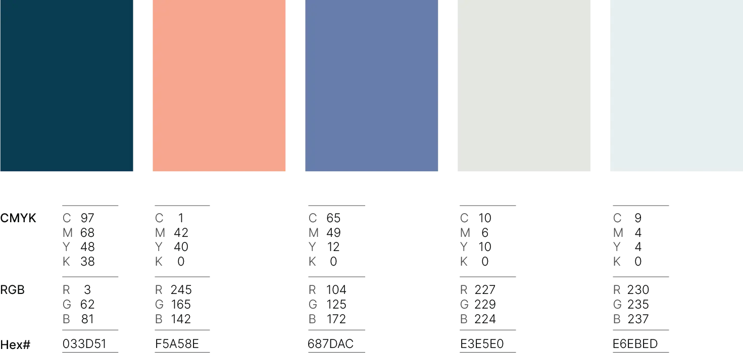
Get Reconnected Colors
Get Reconnected Typography
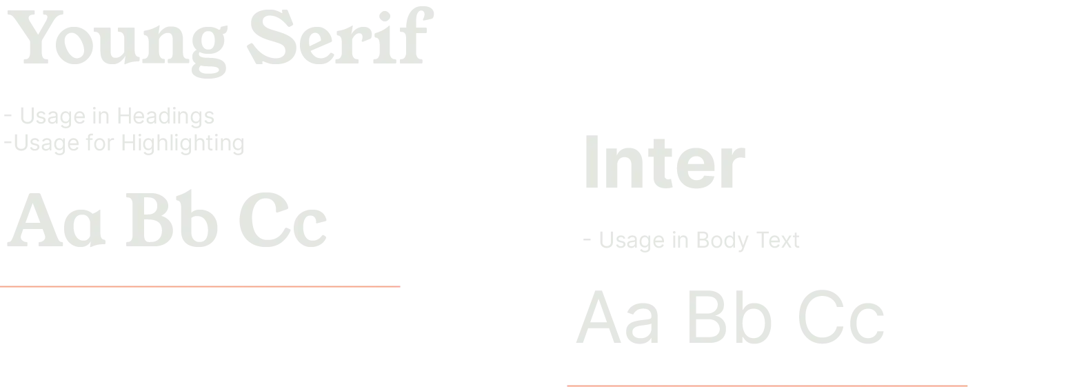
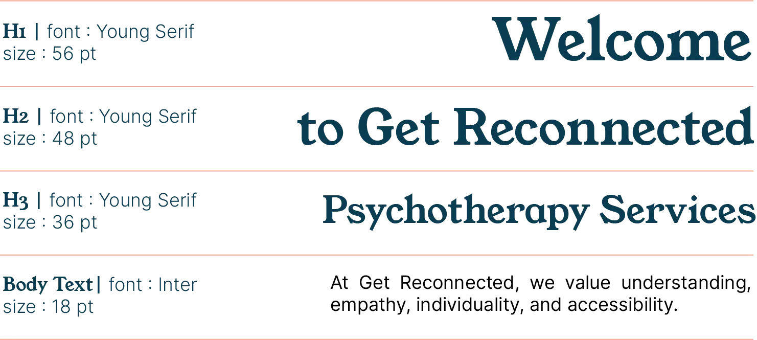
Typography Usage
